How to create modal components in Angular
This post is about how to make your own modal window components in Angular 5+
TL;DR
Check the live demo on StackBlitz Angular Modal Service.
What is a modal window
In user interface design, a modal window is a graphical control element subordinate to an application’s main window. It creates a mode that disables the main window but keeps it visible, with the modal window as a child window in front of it. Users must interact with the modal window before they can return to the parent application. This avoids interrupting the workflow on the main window. Modal windows are sometimes called modal dialogs because they often display a dialog box.
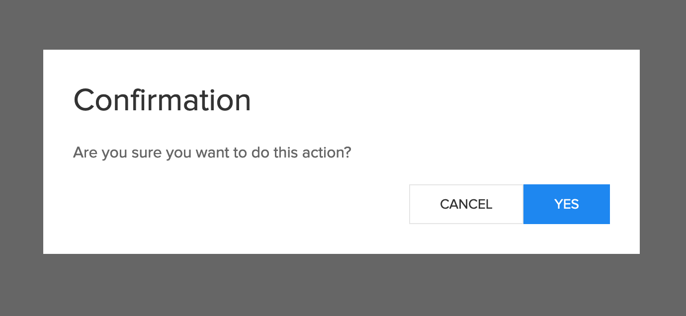
A modal in a web page looks similar to this:
Why you should build your own modal components instead of using an existing library
First of all, the chances of finding a component that matches perfectly and does exactly what you want and how you want, are very small. Either the component does not have everything you need or it has, but it is too heavy and has too many options that you don’t use. Also, if you want to customize the component you need to learn how the component works before trying to extended it and after all of this, you have to make sure that your app remains compatible with all future versions of the component.
Build your own modal components
Next, I will walk you through the process of creating your own modal components, how to use them and how to extend them in order to meet your application requirements.
The requirements:
- very simple API, modal.open(Component, params), accessible from any part of the application
- abstract away all the logic about creation, destruction and animation of the modal components
- make the components flexible and extendable enough to meet all your application requirements
Let’s get started!
Create a new Angular project
To generate a new project, make sure you have the angular-cli installed and use this command at the desired project destination:
ng new angular-modal-service
cd angular-modal-service
The modal component
This is the base for all other modal windows:
import { Component } from '@angular/core';
import { trigger, animate, transition, style,
    query, animateChild, group } from "@angular/animations";

@Component({
    host: {
        '[@modal]': 'true'
    },
    selector: 'app-modal',
    template: `
    <div class="uk-modal uk-open" style ="display: block">
        <div class="uk-modal-dialog uk-modal-body" @modalDialog>
        <ng-content></ng-content>
        </div>
    </div>`,
    animations: [
        trigger('modal', [
            transition('void => *', [
                style({ opacity: 0 }),
                group([
                    query('@modalDialog', animateChild()),
                    animate(150, style({ opacity: 1 })),
                ])
            ]),
            transition('* => void', [
                group([
                    query('@modalDialog', animateChild()),
                    animate(150, style({ opacity: 0 }))
                ])
            ])
        ]),
        trigger('modalDialog', [
            transition('void => *', [
                style({ opacity: 0, transform: 'translateY(-100px)' }),
                animate(300)
            ]),
            transition('* => void', [
                animate(300, style({
                    opacity: 0,
                    transform: 'translateY(-100px)'
                }))
            ])
        ])
    ]
})
export class ModalComponent {
}
For the design of the modal window I used UIKit, a lightweight and modular front-end framework for developing fast and powerful web interfaces, but this example can be easily adapted to any css framework. I also added Angular animations.
To show the component on the page, the best approach is to use an Angular service. In this way the service can be injected and used anywhere.
The modal service
import {
    ViewContainerRef, ReflectiveInjector, Injectable,
    Type, ComponentRef, ComponentFactoryResolver
} from '@angular/core';
import { Observable, Subject, ReplaySubject } from 'rxjs';

@Injectable()
export class ModalService {
    private viewContainerRef: ViewContainerRef;
    public activeInstances: number;
    activeInstances$: Subject<number> = new Subject();
    modalRef: ComponentRef<any>[] = [];

    constructor(private resolver: ComponentFactoryResolver) {
    }

    RegisterContainerRef(vcRef: ViewContainerRef) {
        this.viewContainerRef = vcRef;
    }

    open<T>(component: Type<T>, parameters?: Object):
        Observable<ComponentRef<T>> {

        const componentRef$ = new ReplaySubject();

        const injector = ReflectiveInjector.fromResolvedProviders([],
            this.viewContainerRef.parentInjector);
        const factory = this.resolver.resolveComponentFactory(component);
        const componentRef = factory.create(injector);

        this.viewContainerRef.insert(componentRef.hostView);
        Object.assign(componentRef.instance, parameters);
        this.activeInstances++;
        this.activeInstances$.next(this.activeInstances);
        componentRef.instance['componentIndex'] = this.activeInstances;
        componentRef.instance['destroy'] = () => {
            this.activeInstances--;
            this.activeInstances = Math.max(this.activeInstances, 0);

            const idx = this.modalRef.indexOf(componentRef);
            if (idx > -1) {
                this.modalRef.splice(idx, 1);
            }
            this.activeInstances$.next(this.activeInstances);
            componentRef.destroy();
        };

        this.modalRef.push(componentRef);
        componentRef$.next(componentRef);
        componentRef$.complete();
        return <Observable<ComponentRef<T>>>componentRef$.asObservable();
    }
}
This service is responsible of creating an instance of the modal window component and of adding it to the page.
Our modal component is created dynamically using ComponentFactoryResolver and injected into the DOM using ViewContainerRef.
For passing the configuration parameters to the instance of the component we will use Object.assign() method.
In order to get a reference to our ViewContainerRef we need another component. We will call this the modal container and this will act as the anchor point for our dynamically generated components.
The modal container
import {
    Component, OnInit, ViewChild,
    ViewContainerRef, ComponentFactoryResolver
} from "@angular/core";
import { ModalService } from "./modal.service";

@Component({
    selector: 'app-modal-container',
    template: `<div #modalcontainer></div>`
})
export class ModalContainerComponent implements OnInit {
    @ViewChild('modalcontainer', { static: true, read: ViewContainerRef })
    viewContainerRef: ViewContainerRef;

    constructor(
        private modalService: ModalService) {
    }

    ngOnInit() {
        this.modalService.RegisterContainerRef(this.viewContainerRef);
    }
}
This is just a simple component that uses the @ViewChild decorator to get a reference to the ViewContainerRef. In the ngOnInit() method we will pass the reference of the ViewContainerRef to our modal service by using ModalService.RegisterContainerRef() method.
Also don’t forget to add the component to the app.component.html
<app-modal-container></app-modal-container>
The modal base
export class ModalBase {
    destroy: Function;
    componentIndex: number;
    closeModal() {
        this.destroy();
    }
}
The modal base is a template class and contains the definition of the function used to close and destroy the component.
All our modal components must extend this class in order to be able to properly close and destroy the components.
Now that we have everything set up, let’s create some modal dialogs that actually do something.
A basic and a confirmation dialog example
import { Component } from '@angular/core';
import { ModalBase } from '../modal/modal.base';

@Component({
    selector: 'app-basic-modal',
    template: `
    <app-modal>
        <h2 class="uk-modal-title">{{title}}</h2>
        <p>{{content}}</p>
        <div class="uk-text-right">
            <button class="uk-button uk-button-default"
                    type="button"
                    (click)="onClose()">Close</button>
        </div>
    </app-modal>`
})
export class BasicModalComponent extends ModalBase {
    title: string;
    content: string;

    onClose(): void {
        this.closeModal();
    }
}
This is the basic dialog that shows a message to the user. The user must click on the close button in order to close the dialog and continue to use the application.
This component extents our ModalBase and uses <app-modal></app-modal> component. The content of this components is rendered inside the <ng-content></ng-content> of the modal component.
import { Component } from '@angular/core';
import { ModalBase } from '../modal/modal.base';


@Component({
    selector: 'app-confirmation-modal',
    template: `
    <app-modal>
        <h2 class="uk-modal-title">{{title}}</h2>
        <p>{{content}}</p>
        <div class="uk-text-right">
            <button class="uk-button uk-button-default"
                    type="button"
                    (click)="onCancelInternal()">Cancel</button>
            <button class="uk-button uk-button-primary"
            type="button"
            (click)="onOkInternal()">Yes</button>
        </div>
    </app-modal>`
})
export class ConfirmationModalComponent extends ModalBase {
    title: string;
    content: string;
    onCancel = () => { };
    onOk = () => { };

    onCancelInternal(): void {
        this.onCancel();
        this.closeModal();
    }

    onOkInternal(): void {
        this.onOk();
        this.closeModal();
    }
}
This component is just another example of how to use this dialog system to create the modals that you need for your application.
Conclusion
Using the dynamic components in Angular, you can create easily your own modal dialog system that can be extended to meet your application requirements.
You can find the complete source code at github.com/gabihodoroaga/angular-modal-service.
Also you can check the live demo on StackBlitz Angular Modal Service.